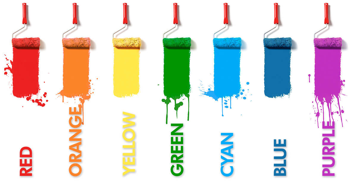
The Right Color on your website can enhance your business
Do you have a strategy for the colors on your website and are you taking color psychology into consideration when deciding what your color scheme should be? Color can be the soul of your design. And it should be the foundation of your marketing program. As you will eventually learn, the right color choice for your company brand and image will help your business in the long run through cohesive marketing and strategic branding.
Harmonious color
Color harmonies can bring spirit, curiosity, and diversity to your company image and intended message. As a result, your companies’ vitality can be portrayed with warm or cool colors depending on how you want people to see you. And harmony can also be achieved by choosing the correct typography to advance your brand image and in choosing the right colors for the right message.
Identify and Communicate
Color is reliable and exact in its communication job. It can be subtle or loud depending on how it is used. And it’s intended use. So by identifying the right color strategy for your brand we can help you determine and select your color to achieve your ultimate brand goals.
Communication is vitally important these days with the amount of information bombarding everyone all the time. Color can convey a message all by itself before any words are shown on the page. If a color can quickly help identify your business in that split second, your message will get to your audience almost instantly.
Did you know:
Green usually represents health, wealth, nature, and tranquility.
Yellow represents youthfulness, happiness, and optimism.
Orange represents enthusiasm, friendliness, and creativity.
Red represents energy, passion, danger, excitement, or urgency.
Pink represents femininity, innocence, and romance.
Purple represents royalty, wealth, and wisdom.
Blue represents security, trust, peace, and calm.
Gray is neutral and represents simplicity, calmness, logic, and the future.
Black represents power, sophistication, luxury, and elegance.
Have you ever wondered why fast food restaurants use warm vibrant colors in their restaurants and marketing? Warm colors, like reds and oranges, convey hunger and trigger emotional responses to hopefully increase your appetite because they want you to buy more of their food. But hospitals use blues and greens in their interior corridors to portray peace, health, and calmness.
And luxury brands use black to evoke professionalism, precision, and strength.
Conscious vs subconscious color reactions
Color and music can be used without words if necessary. Yes, sometimes it is clearer to have words, but a red light usually means stop and a green light means go. No words are really needed on the traffic signal. Your mind subconsciously sees the traffic signal without any words and you step on the gas or the brake depending on the color.
The same goes for your brand’s color. Once the visitor sees your brand enough times, the color you choose helps them identify your name.
Take the time to carefully understand how you want your brand to appear in all of your marketing and promotional collateral.
If you need any advice, feel free to send me a message.
My email is Mark@ReganGraphicDesign.com
I’d be happy to chat with you to go over your color choices or help you decide what you need to effectively grow your business.
#color #ReganGraphicDesign #webdesign #colorharmony #logosandcolors
